The real question: How might we create a tool that can significantly help users fit in nutritional meals into the schedules?
The arrangement and the hierarchy of the layout were brought to focus by low fidelity wire-framing.
I’m excited to showcase my UX/UI project,
Mealify: an easier way to organise recipes.
The project was initiated with the aim of creating a complete experience for users by merging meal-planning with general recipe organising in order to ease the process of everyday eating.
Because everyone eats! Many tend to struggle with maintaining a balanced and healthy diet, or expanding their taste palette.
Through a S.W.O.T analysis, the evaluation of market conditions and capabilities of competitors were conducted.
This approach provided unique value propositions and critical insights, showcasing the needs and areas for enhancement.
Understand users' current struggles with recipe apps and identify common pain points.
Gather insight into user behavior around meal planning and dietary preferences.
Discover opportunities to innovate and improve existing user journeys.
By evaluating the user experience regarding similar platforms, I concluded a chart signifying two critical groups in order to begin the design process.
of 70 survey takers stated that the most common challenge they face when cooking is time

interviewed highlighted struggling with time during their meal-planning and prep process; this leads to them not having nutritious meals
The real question: How might we create a tool that can significantly help users fit in nutritional meals into the schedules?
The arrangement and the hierarchy of the layout were brought to focus by low fidelity wire-framing.
Lato
Meddon
Oxanimum
Components


Purple
Coral
Yellow
Mint
Blue
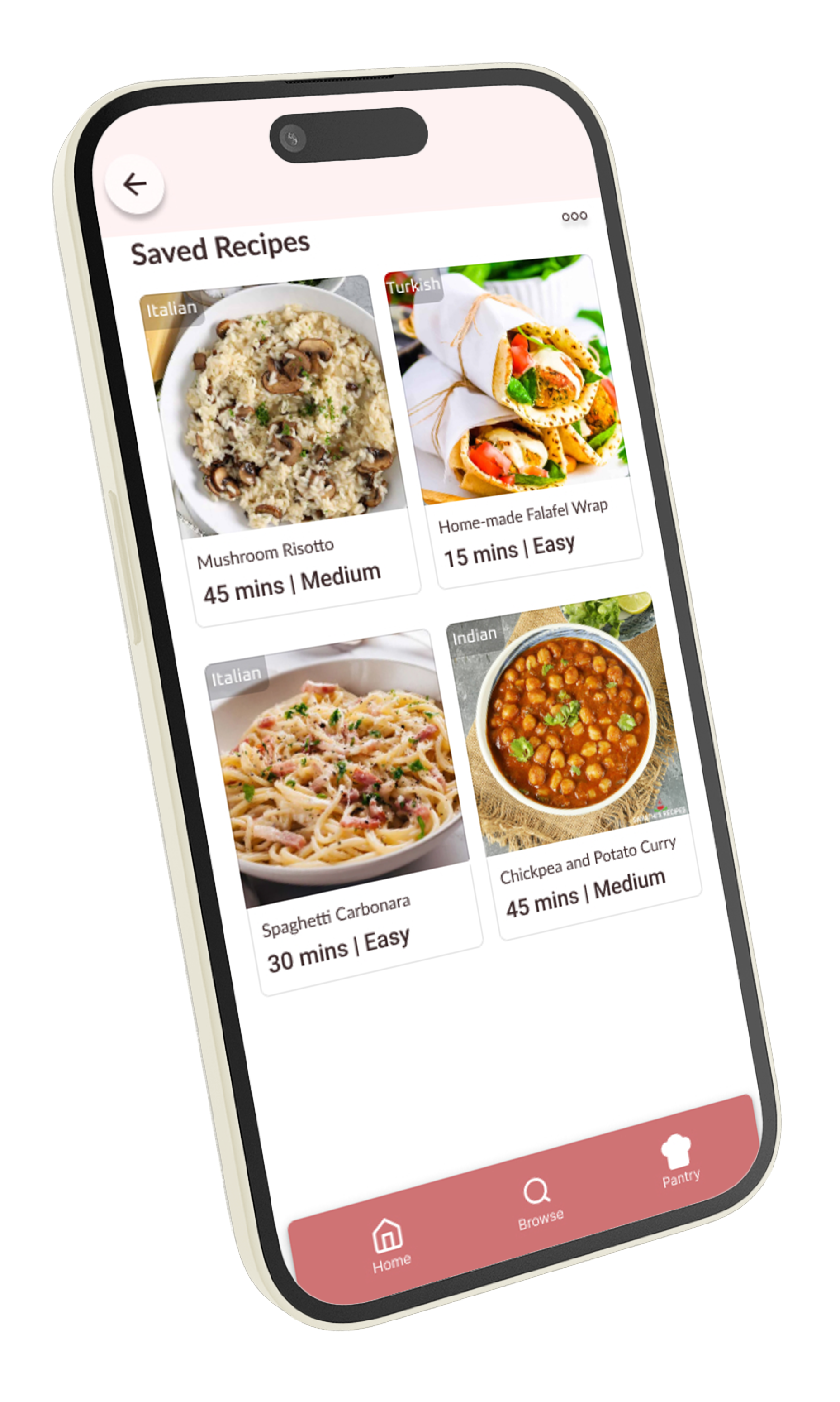
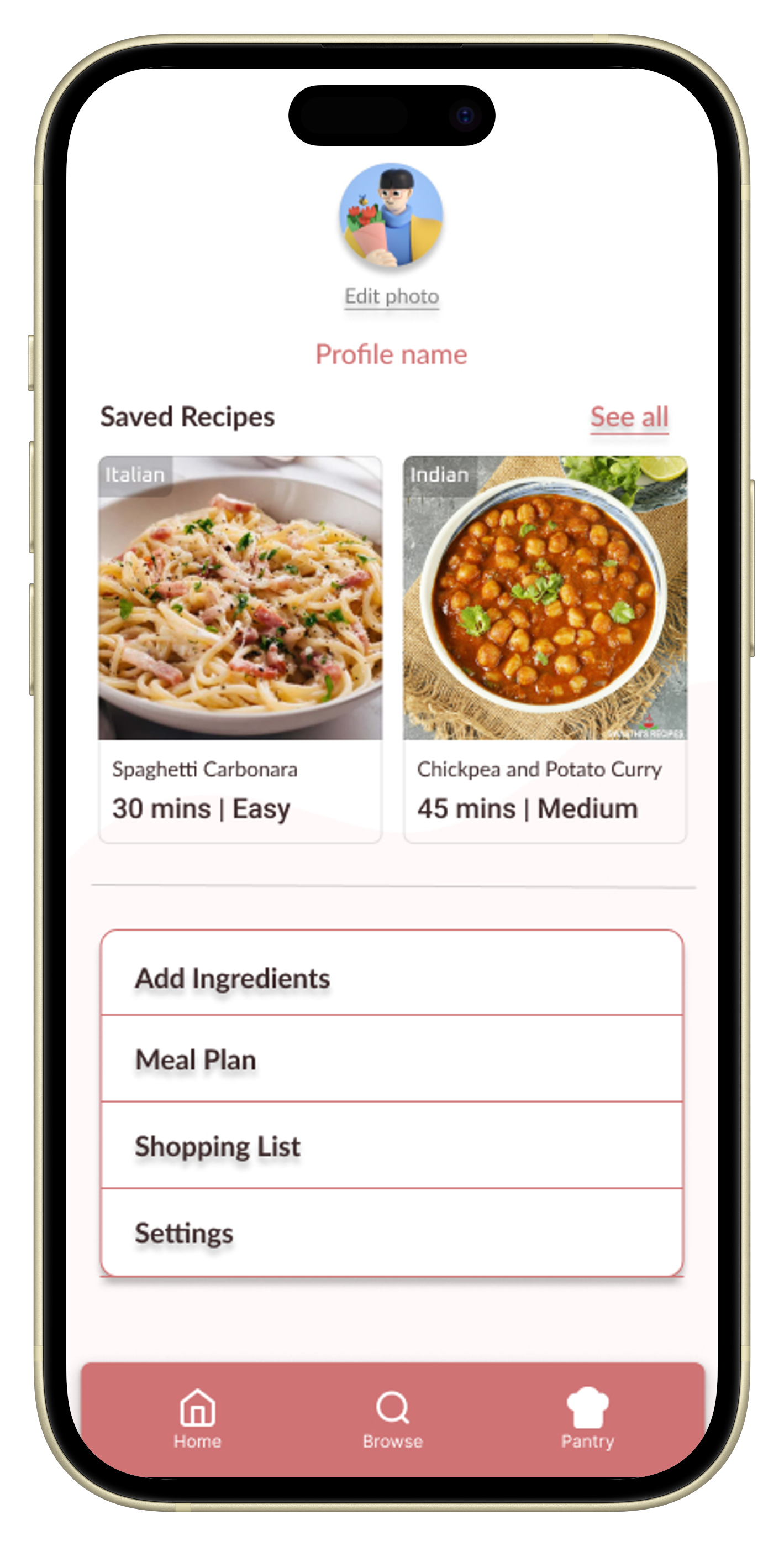
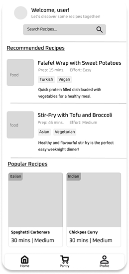
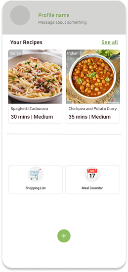
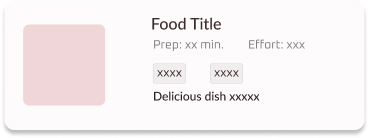
The grid layout design with minimal text allows displaying a variety of recipes without the platform feeling cluttered, this gives the user the freedom to find their desired meal effortlessly.